Point
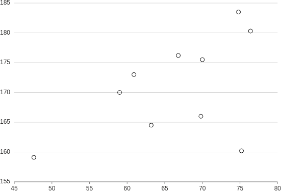
Used for observing a relationship between two numeric variables and exploring common data patterns or finding outliers. Based on the patterns identified, the values can be visually grouped into clusters.
Scatter
The most basic point plot. Good for relatively small datasets where points don't overlap.
from h2o_wave import data

q.page['example'] = ui.plot_card(
    box='1 1 4 5',
    title='Point',
    data=data('height weight', 10, rows=[
        (170, 59),
        (159.1, 47.6),
        (166, 69.8),
        (176.2, 66.8),
        (160.2, 75.2),
        (180.3, 76.4),
        (164.5, 63.2),
        (173, 60.9),
        (183.5, 74.8),
        (175.5, 70),
    ]),
    plot=ui.plot([ui.mark(type='point', x='=weight', y='=height')])
)
Check the full API at ui.plot_card.
Bubble plot
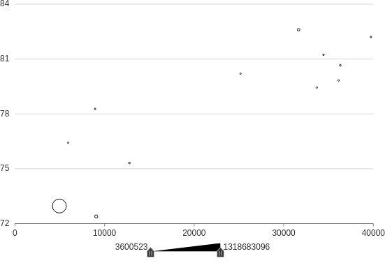
Make a scatterplot with mark sizes mapped to a continuous variable.
from h2o_wave import data

q.page['example'] = ui.plot_card(
    box='1 1 4 5',
    title='Point',
    data=data('lifeExpectancy GDP population', 10, rows=[
        (75.32, 12779.37964, 40301927),
        (72.39, 9065.800825, 190010647),
        (80.653, 36319.23501, 33390141),
        (78.273, 8948.102923, 11416987),
        (72.961, 4959.114854, 1318683096),
        (82.208, 39724.97867, 6980412),
        (82.603, 31656.06806, 127467972),
        (76.423, 5937.029526, 3600523),
        (79.829, 36126.4927, 8199783),
        (79.441, 33692.60508, 10392226),
        (81.235, 34435.36744, 20434176),
        (80.204, 25185.00911, 4115771)
    ]),
    plot=ui.plot([ui.mark(type='point', x='=GDP', y='=lifeExpectancy', size='=population')])
)
Shapes
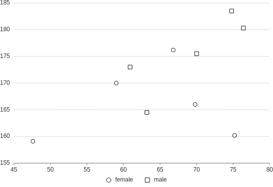
Make a scatterplot with categories encoded as mark shapes.
from h2o_wave import data

q.page['example'] = ui.plot_card(
    box='1 1 4 5',
    title='Point',
    data=data('gender height weight', 10, rows=[
        ('female', 170, 59),
        ('female', 159.1, 47.6),
        ('female', 166, 69.8),
        ('female', 176.2, 66.8),
        ('female', 160.2, 75.2),
        ('male', 180.3, 76.4),
        ('male', 164.5, 63.2),
        ('male', 173, 60.9),
        ('male', 183.5, 74.8),
        ('male', 175.5, 70),
    ]),
    plot=ui.plot([ui.mark(type='point', x='=weight', y='=height', shape='=gender')])
)
Heatmap
For cases when you have just too many points that overlap and together create just a single big point, it might be a better idea to use a heat map.

from h2o_wave import data

q.page['example'] = ui.plot_card(
    box='1 1 4 5',
    title='Heatmap',
    data=data('year person sales', 10, rows=[
        ('2021', 'Joe', 10),
        ('2022', 'Jane', 58),
        ('2023', 'Ann', 114),
        ('2021', 'Tim', 31),
        ('2023', 'Joe', 96),
        ('2021', 'Jane', 55),
        ('2023', 'Jane', 5),
        ('2022', 'Tim', 85),
        ('2023', 'Tim', 132),
        ('2022', 'Joe', 54),
        ('2021', 'Ann', 78),
        ('2022', 'Ann', 18),
    ]),
    plot=ui.plot([ui.mark(type='polygon', x='=person', y='=year', color='=sales',
                color_range='#fee8c8 #fdbb84 #e34a33')])
)
Map
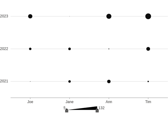
Make a plot to compare quantities across categories. Similar to a heatmap, but using size-encoding instead of color-encoding.
from h2o_wave import data

q.page['example'] = ui.plot_card(
    box='1 1 4 5',
    title='Points, size-encoded',
    data=data('year person sales', 10, rows=[
        ('2021', 'Joe', 10),
        ('2022', 'Jane', 58),
        ('2023', 'Ann', 114),
        ('2021', 'Tim', 31),
        ('2023', 'Joe', 96),
        ('2021', 'Jane', 55),
        ('2023', 'Jane', 5),
        ('2022', 'Tim', 85),
        ('2023', 'Tim', 132),
        ('2022', 'Joe', 54),
        ('2021', 'Ann', 78),
        ('2022', 'Ann', 18),
    ]),
    plot=ui.plot([ui.mark(type='point', x='=person', y='=year', size='=sales', shape='circle')])
)
Groups
Make a scatterplot with categories encoded as colors.
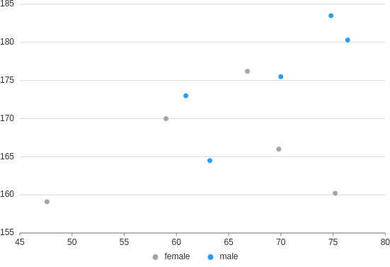
from h2o_wave import data

q.page['example'] = ui.plot_card(
    box='1 1 4 5',
    title='Point, groups',
    data=data('gender height weight', 10, rows=[
        ('female', 170, 59),
        ('female', 159.1, 47.6),
        ('female', 166, 69.8),
        ('female', 176.2, 66.8),
        ('female', 160.2, 75.2),
        ('male', 180.3, 76.4),
        ('male', 164.5, 63.2),
        ('male', 173, 60.9),
        ('male', 183.5, 74.8),
        ('male', 175.5, 70),
    ]),
    plot=ui.plot([ui.mark(type='point', x='=weight', y='=height', color='=gender', shape='circle')])
)
Customization
Customize a plot's fill/stroke color, size, and opacity.
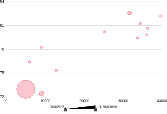
from h2o_wave import data

q.page['example'] = ui.plot_card(
    box='1 1 4 5',
    title='Point',
    data=data('lifeExpectancy GDP population', 10, rows=[
        (75.32, 12779.37964, 40301927),
        (72.39, 9065.800825, 190010647),
        (80.653, 36319.23501, 33390141),
        (78.273, 8948.102923, 11416987),
        (72.961, 4959.114854, 1318683096),
        (82.208, 39724.97867, 6980412),
        (82.603, 31656.06806, 127467972),
        (76.423, 5937.029526, 3600523),
        (79.829, 36126.4927, 8199783),
        (79.441, 33692.60508, 10392226),
        (81.235, 34435.36744, 20434176),
        (80.204, 25185.00911, 4115771)
    ]),
    plot=ui.plot([ui.mark(type='point', x='=GDP', y='=lifeExpectancy', size='=population', size_range='4 30',
                          fill_color='#eb4559', stroke_color='#eb4559', stroke_size=1, fill_opacity=0.3,
                          stroke_opacity=1)])
)
Annotations
Add annotations (points, lines, and regions) to a plot.

from h2o_wave import data

q.page['example'] = ui.plot_card(
    box='1 1 4 5',
    title='Point',
    data=data('height weight', 10, rows=[
        (170, 59),
        (159.1, 47.6),
        (166, 69.8),
        (176.2, 66.8),
        (160.2, 75.2),
        (180.3, 76.4),
        (164.5, 63.2),
        (173, 60.9),
        (183.5, 74.8),
        (175.5, 70),
    ]),
    plot=ui.plot([
        ui.mark(type='point', x='=weight', y='=height', x_min=0, x_max=100, y_min=0, y_max=100),  # the plot
        ui.mark(x=50, y=50, label='point'),  # A single reference point
        ui.mark(x=40, label='vertical line'),
        ui.mark(y=40, label='horizontal line'),
        ui.mark(x=70, x0=60, label='vertical region'),
        ui.mark(y=70, y0=60, label='horizontal region'),
        ui.mark(x=30, x0=20, y=30, y0=20, label='rectangular region')
    ])
)